
WWDC22: Create a SwiftUI Chart With a Form For Changing Data
Daily Coding Tip 102

Celebrating WWDC 2022 and the 100th Daily Coding Tip 🥳
All tutorials will be free this week!

All WWDC 2022 content on Type Safely will be available for free subscribers!
Charts were introduced in the Platforms State of The Union during the first day of Apple’s WWDC yesterday. This should be an interesting way to visualise data, especially in widgets and on Apple Watch. This tutorial will cover the basics of getting a bar and line chart to work, but many of the other charts work in similar ways.
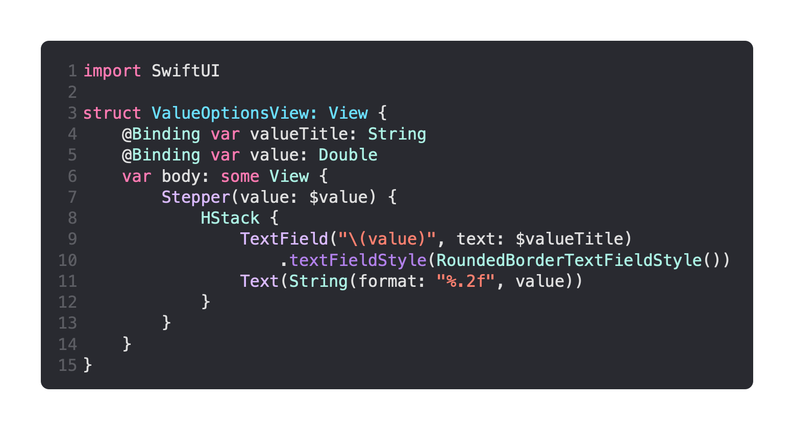
The first view I’m going to create is ValueOptionsView. This is a fairly simple view that will display controls for changing a single data point. It allows for the change of a value’s title, as well as the changing of the value itself. This is done by the Label of a Stepper , which contains a TextField for modifying the title, as well as a simple Text to display the current value.
The data is available in ContentView, but it is not stored as such.
A computed property called data provides three instances of ChartData, all of which get their values from @State properties that can be changed. In other words, every time the view is redrawn, a new version of the array is created with the latest values provided by each Stepper and TextField below the chart.

The foreground style has been set to red for all of the bars.
The title that is typed into each TextField should appear at the bottom of the bar chart, while using the Stepper should allow you to modify the height of the bars. If you are on a device instead of a Simulator, where the keyboard can be toggled with Cmd + K, the return key on the keyboard should dismiss it from view.
The important thing to note is that the chart data must be Identifiable.
This code is based on an example from Apple’s documentation that did not use a structure conforming to Identifiable, and which doesn’t currently compile as a result.
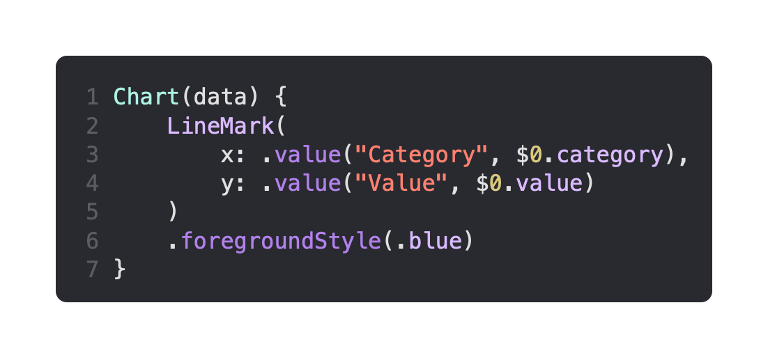
It’s just as easy to create a line chart the same way, by passing it the same data as before:
It’s even possible to display both a bar and line on the same chart. When I tried, it didn’t seem to matter what order I put my bar and line marks in. I seemed to always end up with the bars on top. You might be able to work that out, but I realised that marks can be given an opacity, so it’s possible to make the bars translucent so that you can see the line underneath:

It’s possible to hide the chart legend with .chartLegend(.hidden), or you can set it to .automatic or .visible. You can toggle the visibility of the X and Y axes with .chartXAxis() and .chartYAxis() respectively.
The background of the chart area can be customised with a closure that has access to a proxy of the chart:

As you can see in the .onAppear modifier, several helpful functions and properties come with the ChartProxy object, which can help in making a more complicated background for your chart.
Have a go with some other chart types and see what you can do!