
Use .layoutPriority To Specify Which View Occupies The Most Available Space
Daily Coding 212


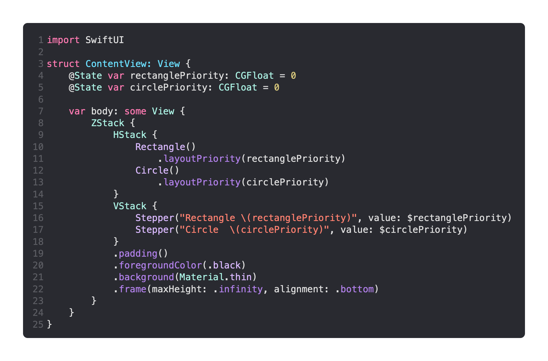
I thought it would be fun to play around with layout priority at runtime. This makes it easy to demonstrate how this changes how views are given allowed to crush each other based on their importance.
Here’s what I found:

It’s quite simple really. When the Rectangle has a larger priority, such as 1 when the Circle has a priority of zero, the Rectangle takes up the entire space. When the Circle has a larger priority, it crushes the Rectangle out of existence in a similar way. Only when the numbers are equal such as both being zero, although any number would do, is the space equally shared.
This simple example is only based on a situation where neither shape has an explicit size, and so they are completely at the mercy of the layout priority modifier.
Here’s how I went about it, it’s nothing particularly complicated.
The shapes are in an HStack, and there’s a Slider for each priority in a VStack overlaying the shapes in a ZStack.
Feel free to experiment with how adding a frame to either shape. Remember to use the version of .frame() that takes minimum or maximum widths or heights.
Using a fixed width and height will simply override the layout priority modifier.
